UX/UI Design - TRIUMF
The design phase of this project was accelerated to six months due to a security issue on the previous platform. In my role as UX/UI lead I developed this design from conception to implementation.
Timeline: 6 months
Team: In-house team of three
Skills: Wireframing, Creative coding, Prototyping, A/B testing, Usability testing, Branding, Design system creation, No-code front end development
Results:
Problem
TRIUMF had been facing challenges due to their website’s lack of intentional design. For many years it has been confusing to navigate, frustrating to use, difficult to update and inaccessible. Accessibility laws and a tight security timeline lead to an aggressive project timeline to rethink the way TRIUMF engages with its numerous external users. For a full user research summary please refer to this project: TRIUMF UX Research.
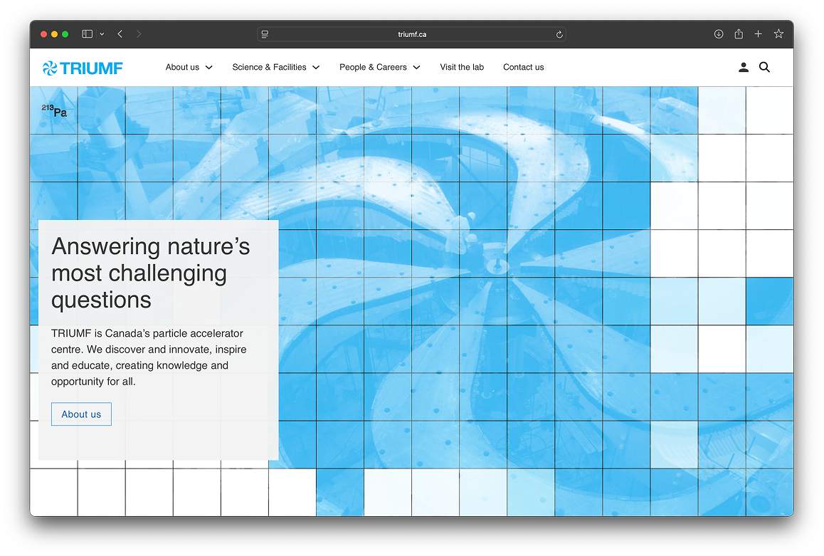
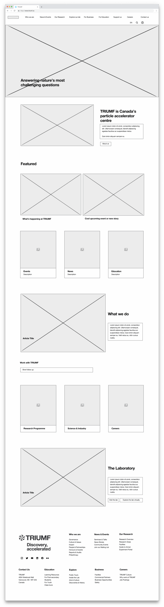
Previous TRIUMF Website
Definition
Leveraging the UX research I previously completed, knowing we had a very short timeline, I focused on a few key aspects of the website: the information architecture, the branding, the home page experience and the research experience.
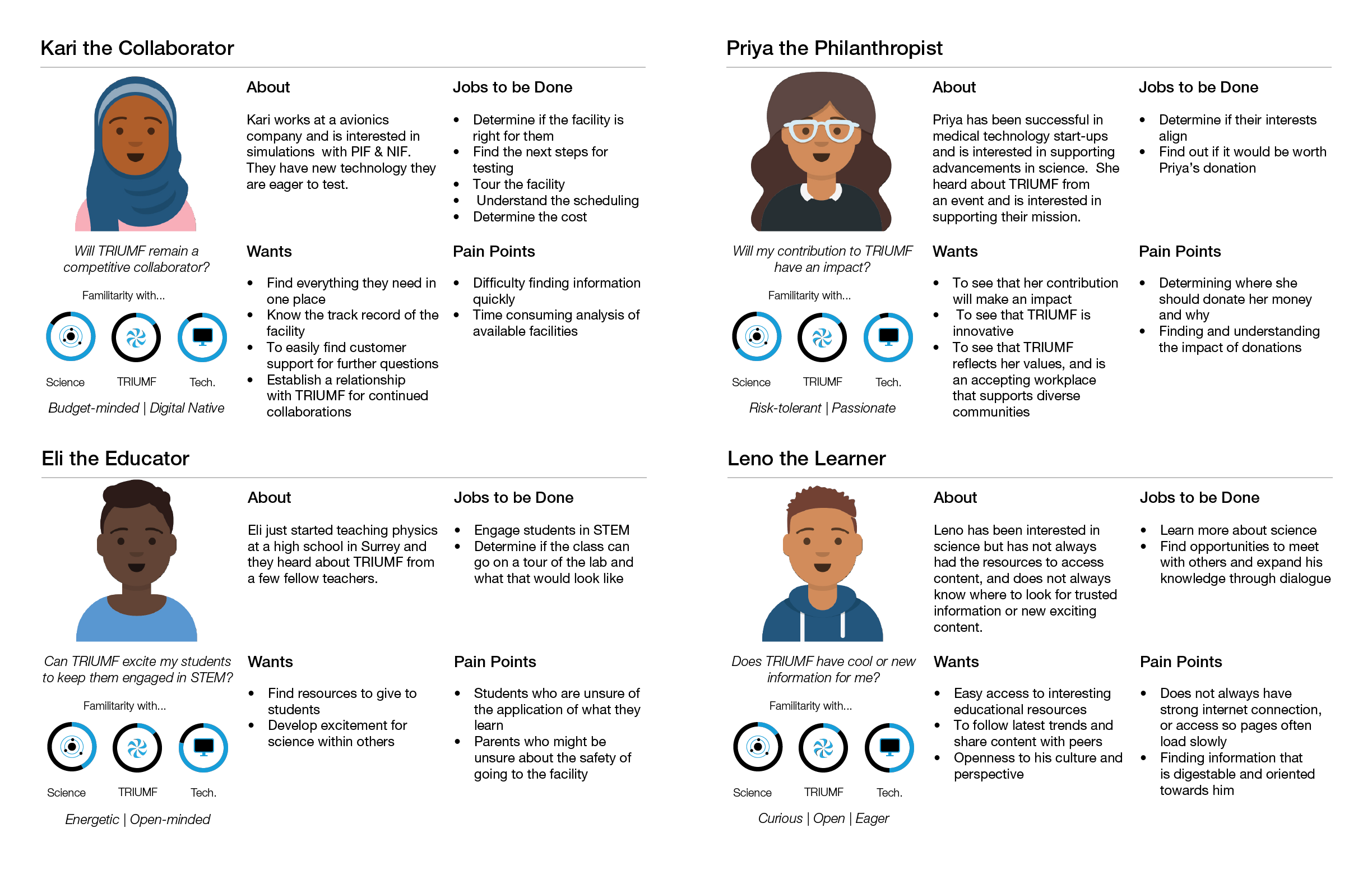
Personas Developed during UX Reserach Study
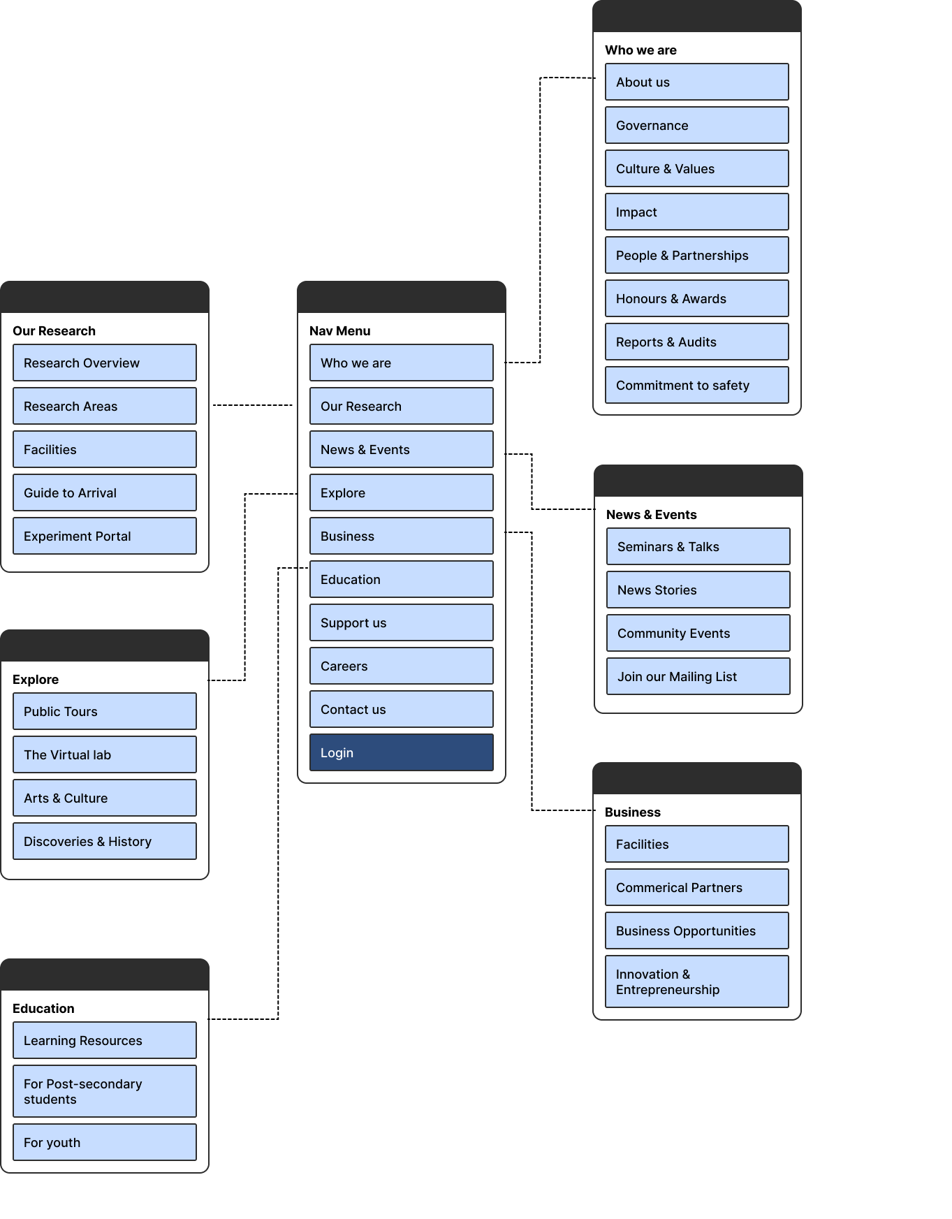
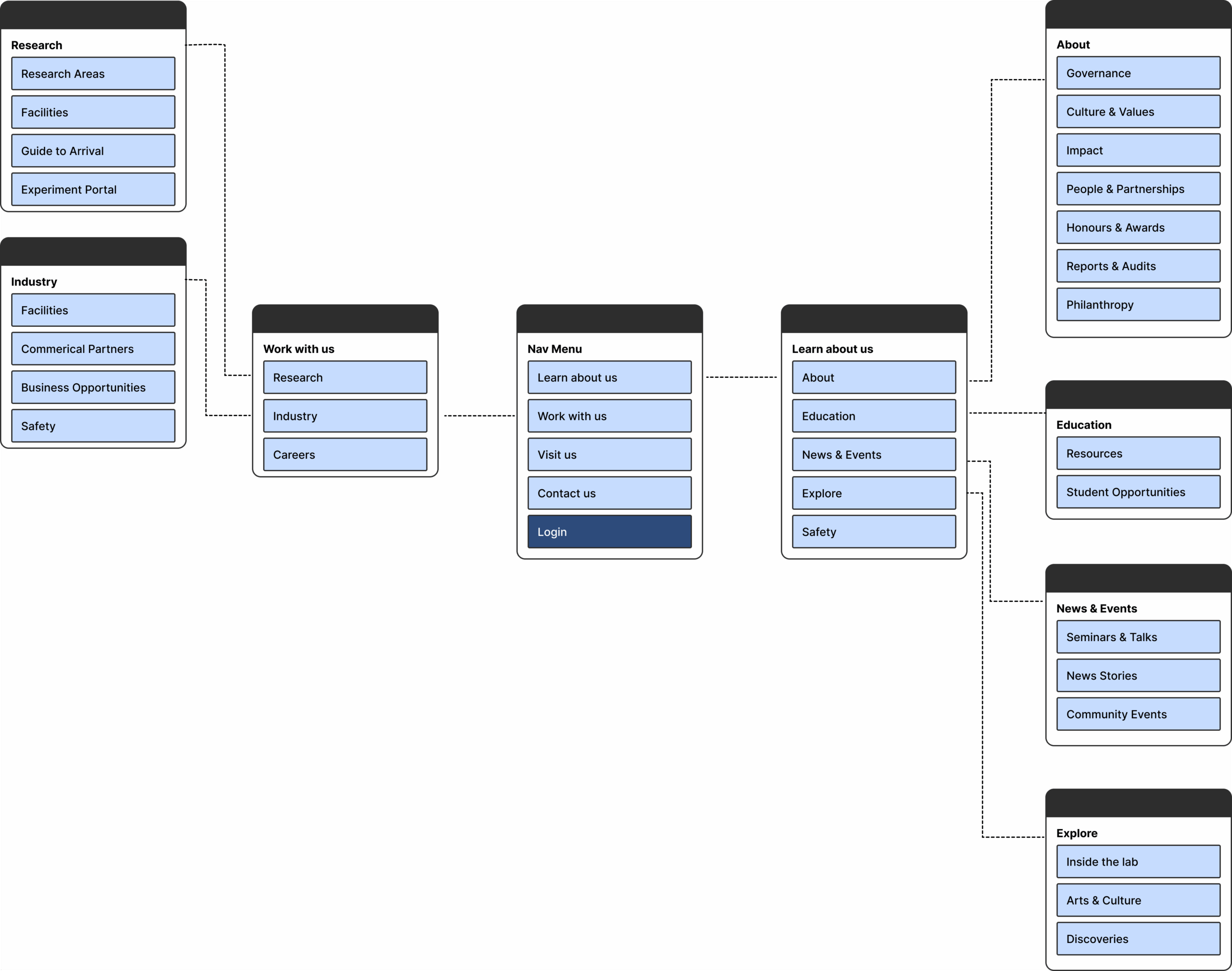
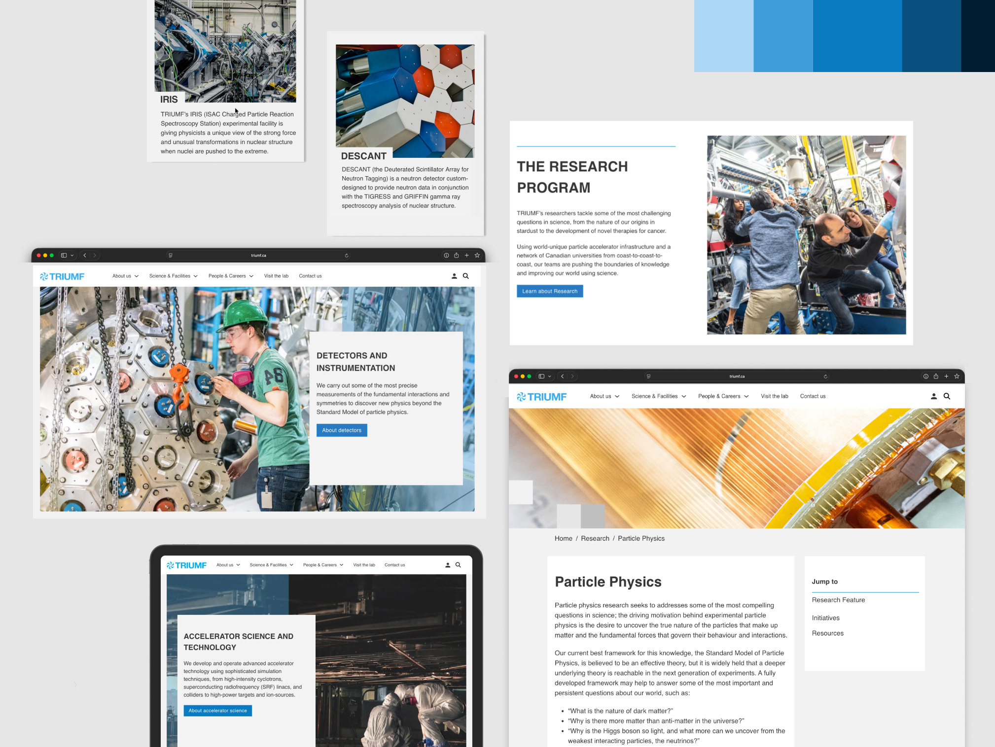
Information architecture
Since the logic of the previous website was the greatest pain point users were facing, I focused on creating a more intuitive structure. Using the card sorting data I analyzed during my inital UX research study, I created prototypes of navigation menus in Figma and then conducted numerous usability tests to refine the experience.
The greatest challenge with this development was the breadth of users who come to TRIUMF, from Vancouver locals concerned about nuclear research, to various electronics companies looking to purchase beamtime, to visiting scientists, to government funding agents who determine the future of TRIUMF.
branding
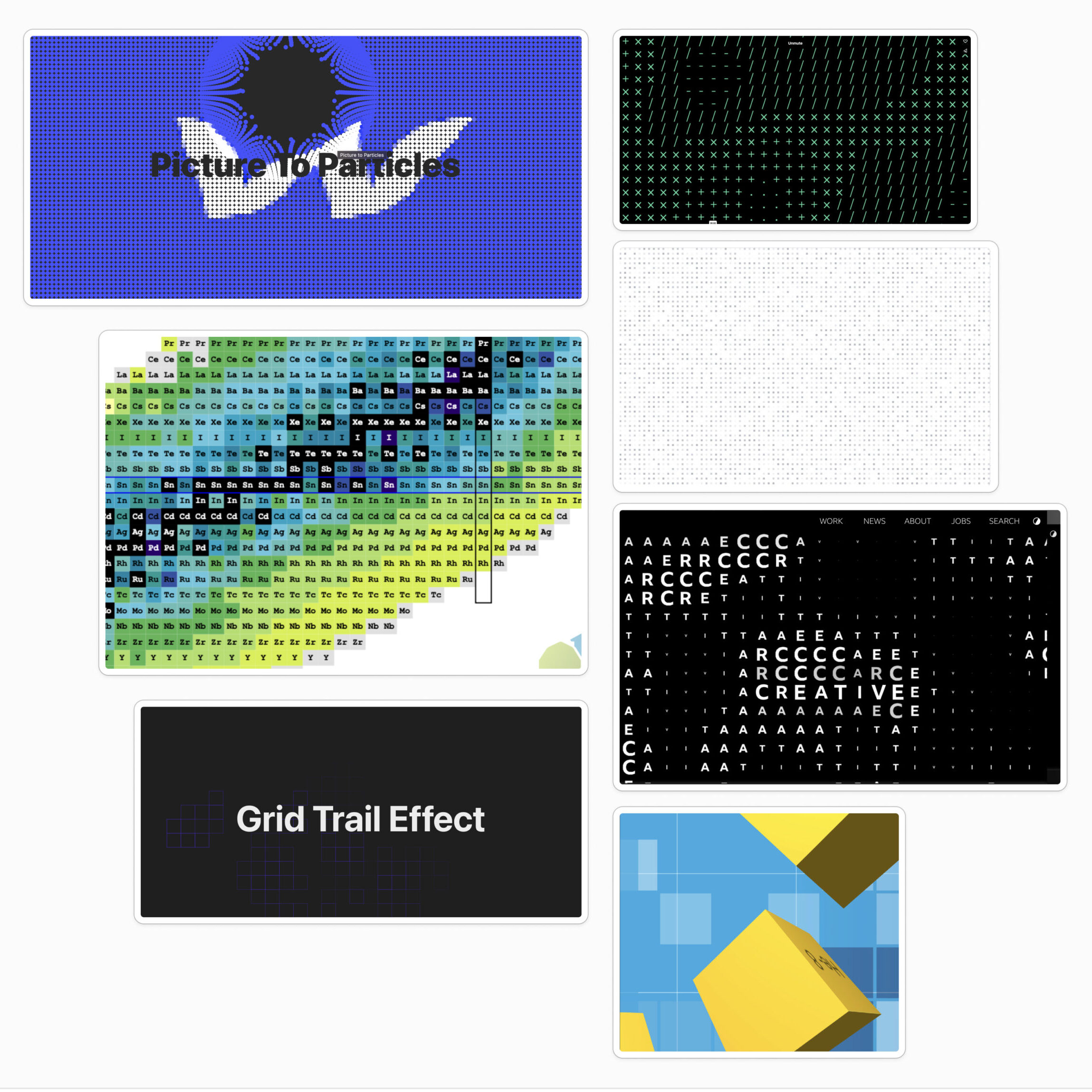
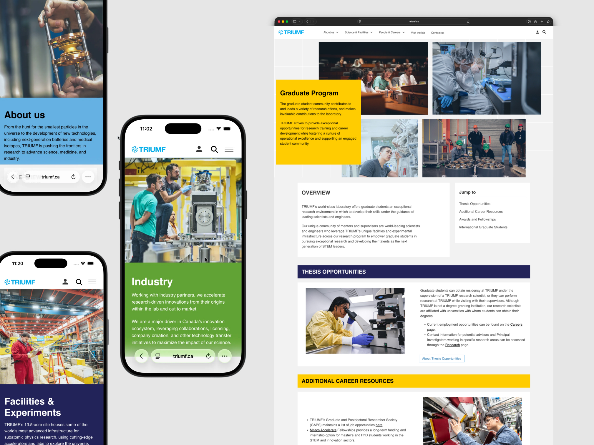
In order to create a more cohesive TRIUMF story the branding needed a clear visual throughline which permeated every page on the website. I developed a series of concepts revolving around artistically visualizing the science at TRIUMF. After testing these, I moved forward with a direction based on the Table of Nuclides, the ‘sister’ of the periodic table which shows elements and their half-lives.
To symbolize the primary science driver at TRIUMF and add an ‘easter egg’ for science enthusiasts I coded an animation using scientific data from the Table of Nuclides to represent isotope decay. This decay concept was well received in focus groups and became a primary branding driver throughout the website. This was reinforced through the use of grids, squares, and colours.
We heard complaints about the mystification of science at TRIUMF, so in the redesign we chose to show the audiences what a particle accelerator centre really looks like and hoped to inspire them through showing the human side of the scientists who work there instead of only featuring obscure machinery.
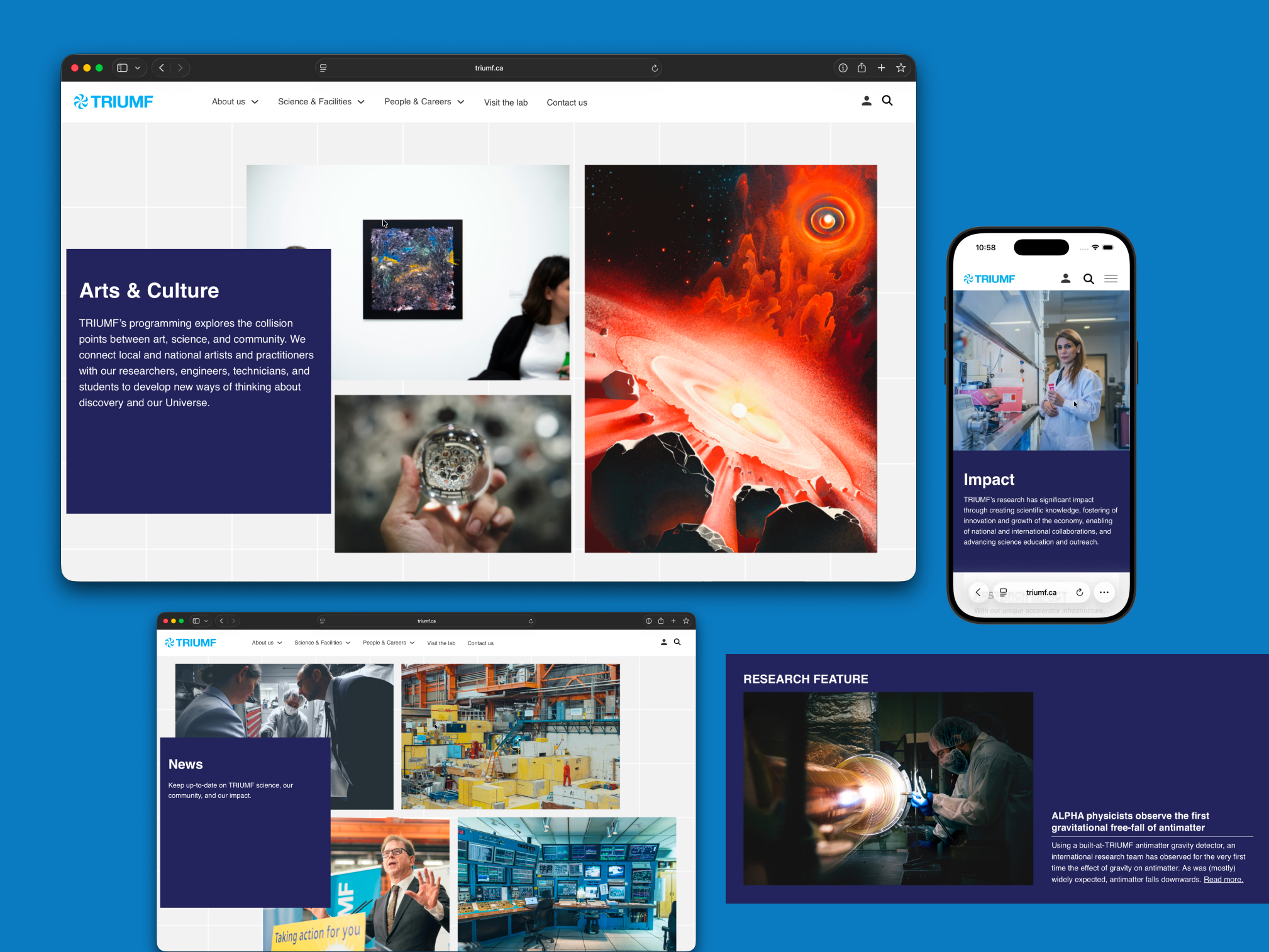
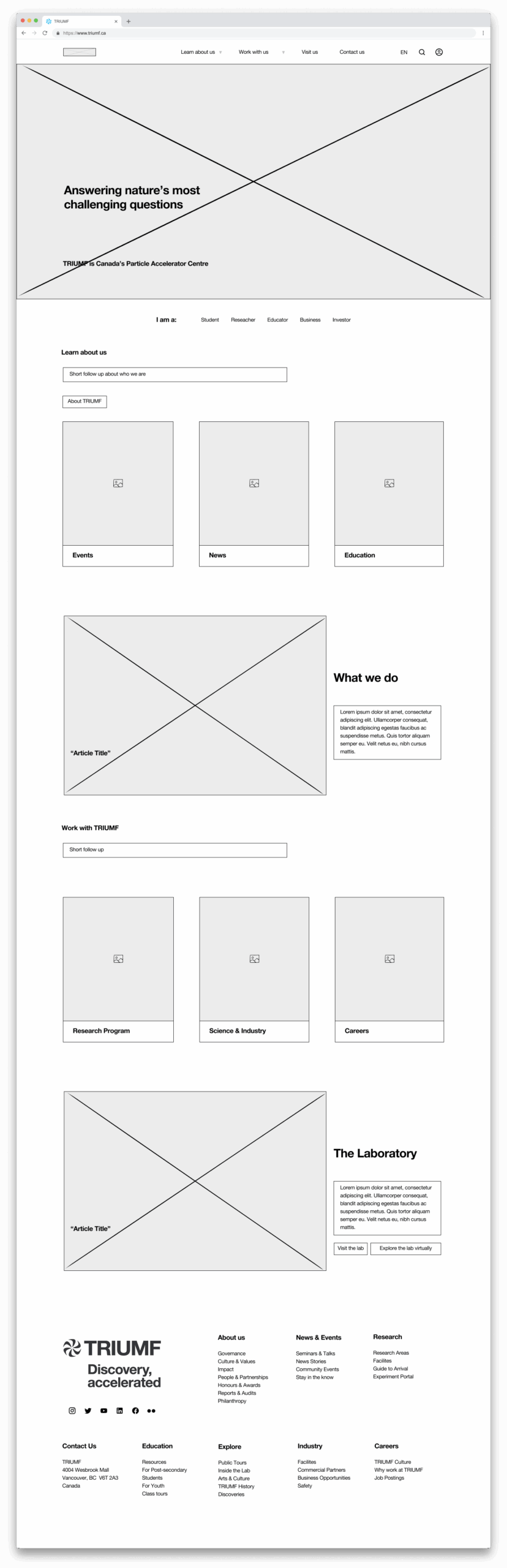
new design
The new homepage aims to excite and engage young scientists and science enthusiasts, while providing an easy and efficient journey for new and frequent collaborators and government agents among many other user journeys. The principles of the home page were to use an accessible, clear, and friendly design to show the science, excite the world about TRIUMF’s mission, and spark new engagements.
View the live site at TRIUMF.ca
Results & Next steps
The website launch in early 2025 marked a new beginning for TRIUMF’s digital ecosystem and proved to be a successful case study within the organization for digital projects.
We received overwhelmingly positive feedback internally and externally from stakeholders and users such as national funding partners and teachers expressing the positive impact of the redesign and the improvements in usability. I presented the UX process used to run this project at a national science communication conference, Science Writers and Communicators of Canada, in June 2025.
The implementation of a design system and clarified structure have saved hundreds of hours internally and made TRIUMF more operationally efficient. Due to the accelerated nature of this project, there are still areas of the website currently being designed and improved.